Sample layout — not an actual client project
All work
BRAND & EDITORIAL
Luxury production showcase
Full-screen video storytelling, nothing spare
- Market
- Türkiye
- Sector
- Creative production · fashion
- Year
- 2026
About the project
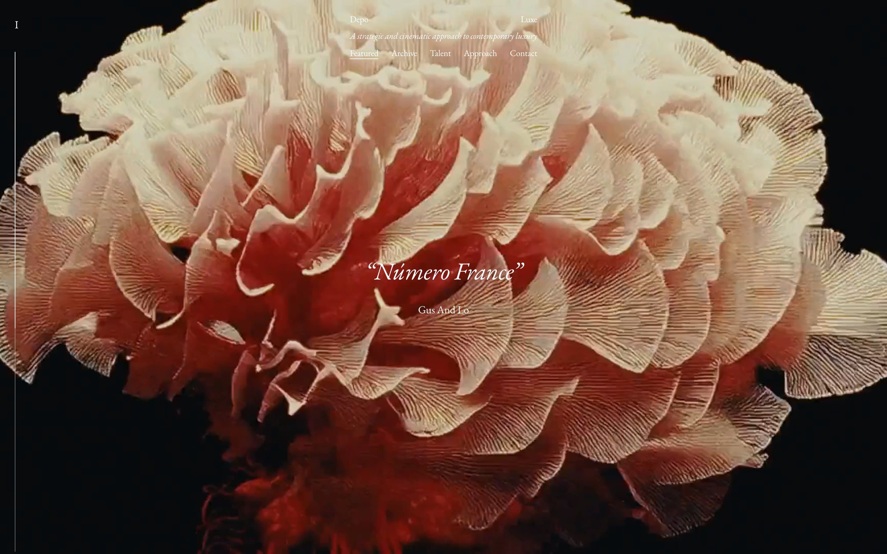
A showcase for a production and talent agency. The classic risk is an interface that drowns the work. Here it is the opposite: the frame fills the screen, navigation shrinks to one thin serif line, and only the title and the credit sit on top.
How it is built
- 01
Frame first
The video opens full-bleed, no border. The site doesn't frame the work — it shows it.
- 02
Navigation stays quiet
Five sections on one line in a fine serif. The menu never competes, yet it is right there.
- 03
Rhythm from the slide number
The corner numeral tells you which piece you are on, so full-screen never feels lost.
Details
Typography does the branding: classic serif, italic subtitle, very little of it. The palette comes from the footage — the site imposes no colour of its own.