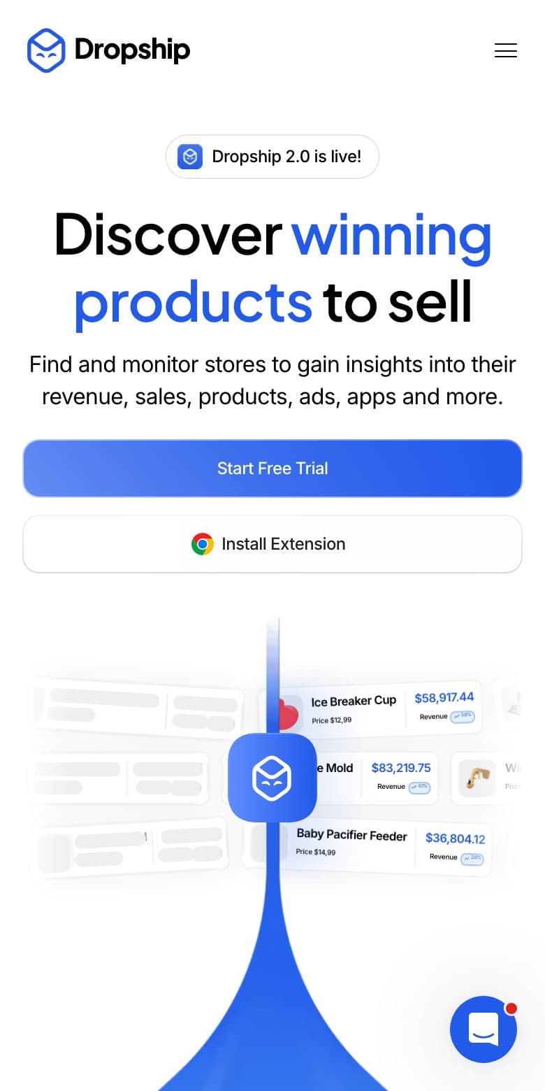
Sample layout — not an actual client project
All work
WEB APP
SaaS analytics platform
Data-heavy product, a three-click trial path
- Market
- UAE · Dubai
- Sector
- SaaS · e-commerce analytics
- Year
- 2026
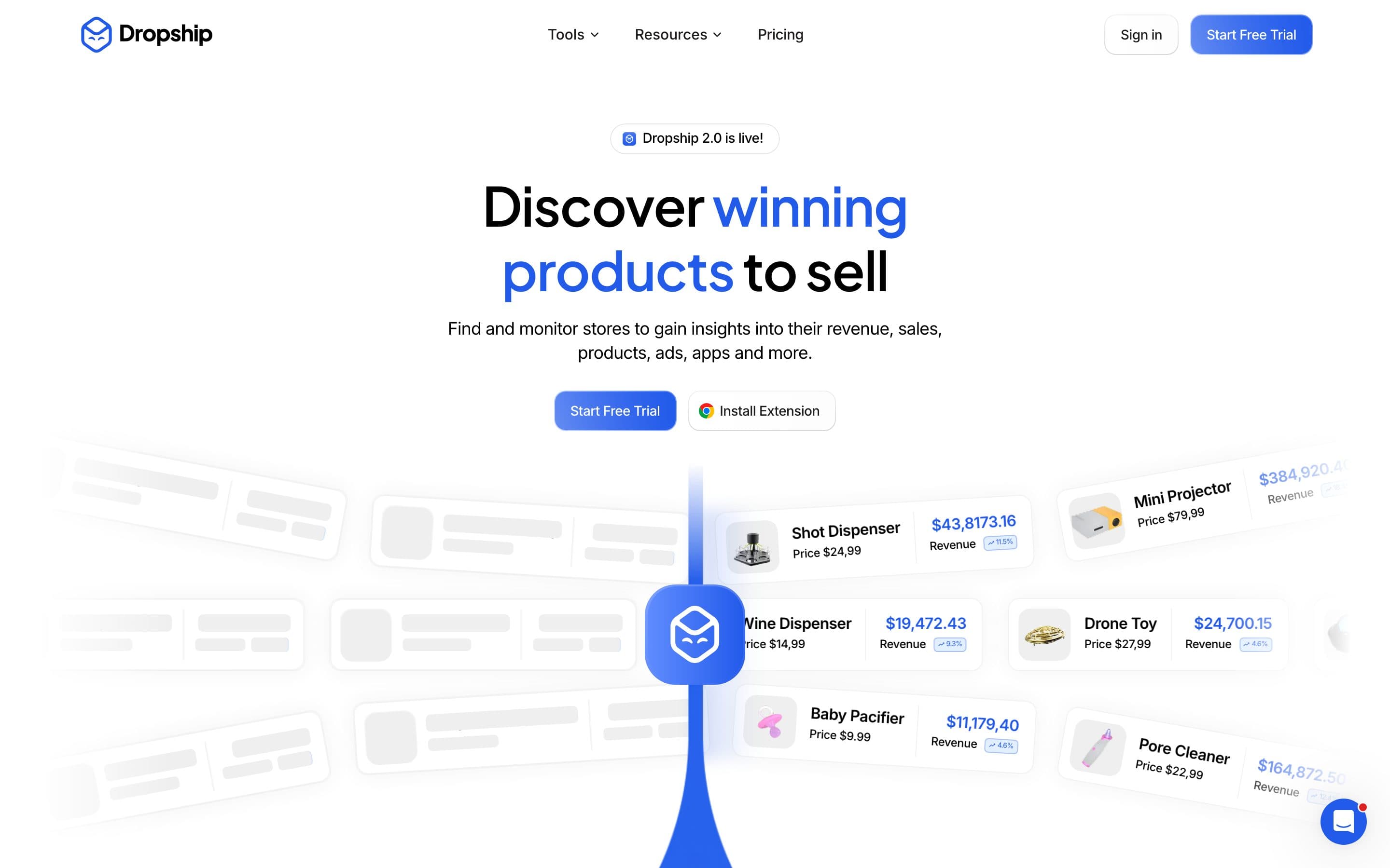
About the project
A product that tracks store and product data. The difficulty: the value lives in numbers, but a table on the first screen sends people away. So the hero turns numbers into a story — live revenue cards float forward while empty skeletons stay behind, and the eye goes straight to the filled ones.
How it is built
- 01
One goal, two routes
Only two buttons on screen: free trial and browser extension. Both feed the same funnel.
- 02
Show it, don't explain it
The illustration is the product UI itself — real card types, real price and revenue rows.
- 03
Mobile just as strong
The hierarchy holds: headline, one line, two buttons, then data. Rebuilt rather than squeezed.
Details
Scroll-triggered motion, a steady type scale, one accent colour. Blue appears only on things you can click, so where to press is never a question.
Mobile view